 |
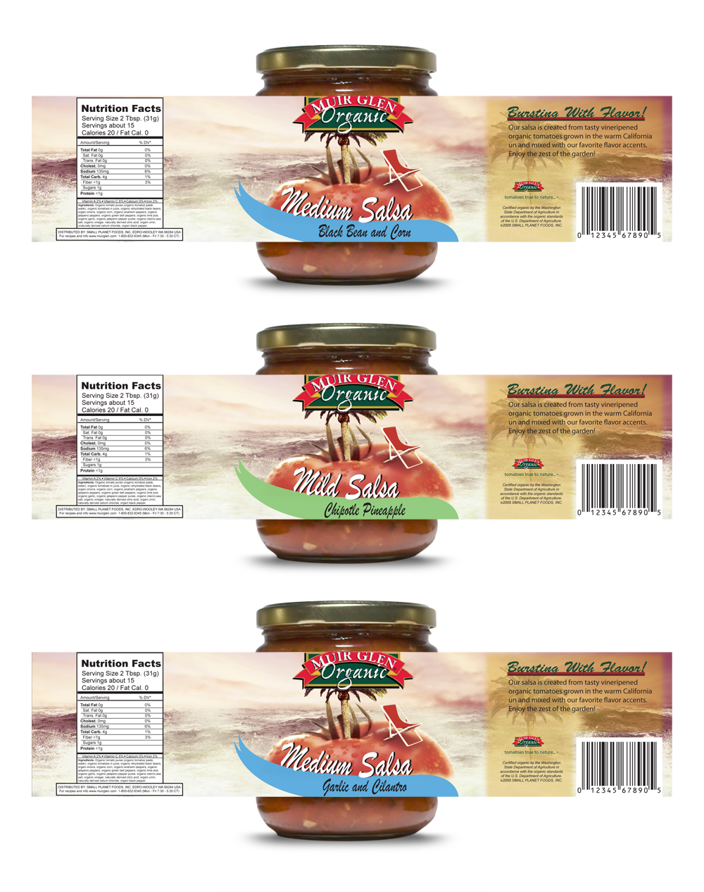
Muir Glen - PackagingThis project was assigned to me in college. The requirements were to take an existing label that could be improved on and to apply it to the packaging that it currently is on. I chose Muir Glen as I thought there would be a better way to display the freshness in their tomatoes other than sticking hundreds of tomatoes on the label. Showing The Freshness In SalsaTomatoes are juicy, fresh, and the perfect summer vegetable. Muir Glen's label was for their salsa line. Salsa is inviting and for snacking or what I like to call a "hang out food". I wanted to incorporate that idea into the graphics as well as the freshness of their tomatoes. I remembered when I was a kid watching the old Ocean Spray commercials the freshness and crashing waves they used. To me it symbolized freshness and bold taste. That is when the idea came to me. Concept ExecutionEverything for the scene with the tomato was executed in Photoshop as it was a classic photo manipulation. Using the photo of a lawn chair, tomato, palm tree and wavy ocean, I combined them into the overall graphic image. After that, I worked with the dielines to center the image properly on the package. I extended the image all the way around to the back of the package where the nutritional facts and description of the salsa was. |
